/
July 20, 2023
Kelli James Website Design
Services:
Overview
objectives
- Create a fast, modern website with easy navigation for a seamless user experience.
- Implement strong security measures to protect data against online threats.
- Develop pages rich in information about insurance services and agency details.
- Incorporate Instagram to showcase real-time engagement and provide fresh content.
- Use strategic CTAs to encourage contact and promote lead generation.
- Initiate a blog with initial posts to enrich content and support marketing efforts.
Color Palette
Logo


Typography
h1 - Poppins
h2 - Poppins
h3 - Poppins
h4 - Poppins
h5 - Poppins
h6 - Poppins
Design Process
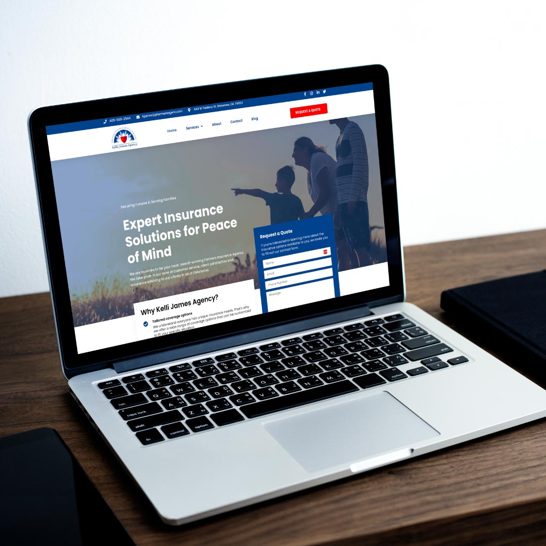
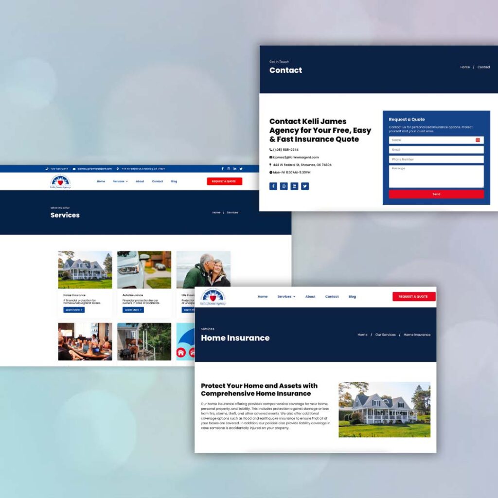
When we set out to redesign Kelli James’ Farmers Insurance Agency website, we really wanted to make it pop while keeping it super user-friendly. We kicked things off by picking a look that felt both fresh and trustworthy, basically making sure it didn’t just look good but felt welcoming too. Speed was a big deal for us; nobody likes to wait around, so we made sure the site loaded fast and getting around it was a breeze. Keeping everything safe and sound was also key, so we beefed up the security to keep the bad guys out. Adding Kelli’s Instagram feed was like giving the website its own live feed, showing off what they’re all about in real-time. And, of course, we sprinkled in some easy-to-spot buttons to nudge visitors to reach out for quotes, making it super simple for them to get in touch.
Results & Impact
The launch of the new website design marked a notable improvement in user engagement. Thanks to its intuitive navigation, visitors now find it much easier to dig through information about insurance services, sparking a noticeable increase in inquiries. This ease of access didn’t just make the site more user-friendly; it played a significant role in elevating Kelli’s brand image. The modern and professional look of the website has solidified her reputation as a reliable and trustworthy insurance agent in Shawnee, OK.
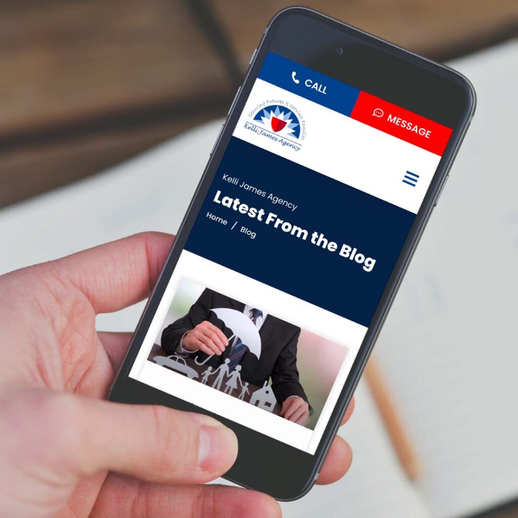
Moreover, this redesign wasn’t just about looks; it was strategic, too. The clever placement of Calls to Action throughout the site, combined with its overall user-friendly vibe, has been a game-changer in generating leads. Kelli’s client base has seen a healthy growth, thanks to these enhancements. And let’s not forget the power of content marketing which came into play with the introduction of a blog section. Filled with informative posts, Kelli has been able to not only showcase her expertise but also build credibility and keep her audience up-to-date on insurance-related topics, rounding off a truly successful overhaul of her website.
Before
A web prescence glow-up
After
Are you an agent in need of a website?
Explore our “Website in a Week” Power-Up or reach out to us now to kickstart your new website!
